Latest reviews
The web platform has many cynics and critics. The litany of complaints includes: incompetent developers (there’s nothing techies love more than being critical of other techies), bloated libraries, framework hell, recalcitrant browser makers, security nightmares, ever-changing specifications, and an unrelenting hype machine. All those criticisms have elements of truth. But there’s also an upside: web development is an open, decentralized, vibrant community, one which seems to inexorably stumble towards making better web applications at least possible.
And it also has open, welcoming subcultures that reject cool, detached cynicism and dominance displays. From projects like Nodeschool to the Recurse Center, there are thousands of people concerned with equipping more of us with the skills to build a better web. I associate Pony Foo with that same culture of learning & sharing. Started as a blog by Nicolás Bevacqua from Buenos Aires, Pony Foo has grown into a larger community that publishes in-depth articles about the web platform (i.e. the JavaScript language, HTML, CSS; various libraries, tools, and frameworks).
Given the rate of change in web development, such resources are indispensable for anyone who wants to do more than maintaining a legacy application. And Pony Foo helpfully provides a roundup of various findings from around the web (courses, tutorials, news, etc.), in a weekly email newsletter, which is just about the right frequency to not be overwhelmed.
While the newsletter highlights Pony Foo’s own articles, they are only a fraction of the content, and the biggest value-add is in the curation of resources from elsewhere. A typical example of a summary:
Dan explains how error handling works in React 16, which is out on public beta since yesterday. React 16 uses Fiber under the hood, although its async rendering capabilities aren’t turned on yet. It is expected this is enabled at some point in the React 16.x release line.
Dan Abramov
As the summary shows, occasionally the newsletter might benefit from some effort to make technical jargon more accessible or to provide a “why should I care” hook. But the headlines are easy enough to scan for stuff that seems relevant to you.
The newsletter does have sponsored posts in it, which are clearly marked. I don’t find them especially problematic and occasionally even useful. The content is under the Creative Commons CC-BY-NC-SA License, which is a bit restrictive (incompatible with Wikimedia projects, for example) but a lot better than conventional copyright. Whether you love or hate the web platform (or love-hate? :), if you regularly build upon it, I highly recommend subscribing (read a sample issue to see if it’s for you).

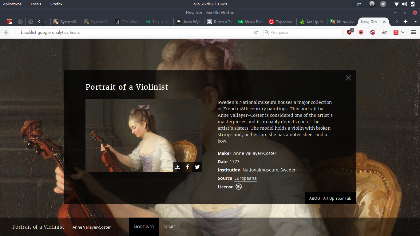
Here’s a great add-on for Firefox, which brings you amazing, little-known artwork from the Europeana collection right to your browser, whenever you open up a new tab. It’s gorgeous and the minimal design also heightens the beauty of it all. This is unmissable for art-lovers. The cherry on top is that all images are freely licensed, which means you can reuse them for whatever purpose!
However, there are several points in which it could improve. Since this is a review of the initial public version (1.0.9), it can kinda be forgiven for some of these mistakes. Firstly, it makes you give up your data to the Googleborg, with no opt-out mechanism (fortunately I’ve blacklisted Google Analytics from my hosts file, and so should you). Come on folks, it’s 2017 and Piwik is here, there’s no need to mistreat your users under the excuse of “we need user metrics”, there are better ways of getting statistics.
The second sin is retrieving the images over an insecure https connection. Let’s Encrypt is here and can be set up fairly simply, so this one is easy to fix. Thirdly, it claims to have its source code under the MIT/X11 License, but the actual source is nowhere to be seen. It’s a little perplexing since they have so many freely licensed projects on the web, so I think they probably forgot to upload it.
Final, and minor points: the image loading times should ideally be faster. How long do we normally spend on newly opened tabs? Only as long as it takes to get us to our destination, so images need to load faster to grip out attention before we resume browsing. Also, the images shown are a little repetitive; maybe the list of curated artworks is too short?
Overall, this is a promising add-on, and even with these issues, I’ll still give it a great rating due to the novelty and design approach taken here. Here’s hoping the next iterations will be even better!
I’ve had an Echo since May 2015 and it’s since joined a two person household. The main functions we use it for these days are: 1) playing random music, mainly from Amazon Prime’s free catalog, 2) as an alarm clock and kitchen timer, 3) as a news/weather info source, 4) as a calendar reminder. Voice recognition is usually solid except when it occasionally can’t hear us at all, e.g. over music playing. Typically, both of us use it at least 1-2 times per day. The fact that it’s plugged in means it becomes seamlessly integrated into your day-to-day life at home without having to worry about yet another device to charge.
There’s an app library but we’ve never used it — it just seems a little clunky to do anything more complicated through this interface. We also don’t use the online shopping features. The device occasionally comes on randomly when it hears the “Alexa” command on TV or radio and starts sputtering random nonsense. It’s amusing but also a bit annoying.
Beyond that, you can converse with it through its (surprisingly large) catalog of canned jokes and limited AI. For the kinds of questions Google can give you a pre-computed answer for, it can be helpful, though I’m usually near a keyboard when I have those. Having a microphone in your room may seem a little weird at first (and continues to have that “a little bit creepy” factor), but honestly, your phone and laptop have the same capabilities.
The sound quality is good for casual listening, and the overall usability of the device is great with lots of nice touches. Very straightforward setup, a remote control you can easily attach to your fridge with a magnetic holder, multiple ways to adjust the volume including on the device itself, etc. I’ve found the Android app a bit sluggish and mostly end up using echo.amazon.com instead.
What’s nicest about Echo is Amazon’s dedication to making the product better, which you really do notice as a user. There are typically a couple of new features per month, such as calendar integration or IFTTT support. At $99 with a Prime membership, it was a good deal.

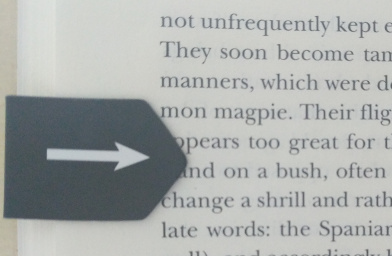
i-clip in use on Charles Darwin’s “Voyage of the Beagle”
i-clips are little folding magnets to use as a bookmark or paperclip. The front has a design (there are several to choose from), the back has a little arrow that marks the specific spot in a book you’re reading. The packs currently sell for $2.59 per pack of 8 at Amazon, and for $3.95 per pack directly from the manufacturer, Peter Pauper Press.
As someone who often has multiple books unfinished (and who prefers paper books in most situations), I find these little guys indispensable. They have two main advantages compared to paper bookmarks: they’re less likely to fall out, and they can mark the specific page and line where you stopped reading.
I can’t think of anything to improve. They make a nice gift, too.
(One note of caution — since these are metal, you do have to be a bit more careful, as they’re fully capable of tearing into a page when pushed into it. It’s only happened once so far and should be easy to avoid.)
My wife Lisa got me a chocolate bar on Saturday. Before I ate it, I read the back of the wrapper to learn more about it.
This chocolate bar came from a company called Chuao Chocolatier. A man in Venezuela started the company. First, he left his technical career; then, he went to Paris to learn to cook. Later, he found his calling—making chocolate (About Chef Michael). This story touched me; like him, I left my technical career. I still seek my calling, but this guy’s story gives me hope.
Chuao calls the bar I got Spicy Maya. Spicy Maya mixes dark chocolate with cinnamon, cayenne pepper and pasilla chile (Spicy Maya Bar). I love all these things. So I could not wait to taste them together in a single bar.
I unfolded the wrapper; I took the bar out. I brought it close to my nose, closed my eyes and took a deep sniff. I smiled.
I opened my eyes. I broke a square of chocolate off of the bar. I put it into my mouth. I rubbed my tongue around the bottom of the square. Then, I sucked on it. I tasted the flavors, one by one.
First, I tasted the chocolate. A sweet, creamy feeling filled my mouth.
Then, I tasted the cinnamon. First, I noticed it in my nose. Then, the taste moved down into my mouth; it mixed in with the chocolate. It made me think of Christmas-time.
Then, I tasted the cayenne pepper. Then, the pasilla chile. The spices gave a kick to the sweetness from the chocolate and cinnamon. It made me think of Mexico, where people like their chocolate spicy!
All these flavors blended. I closed my eyes again; I felt like I was floating up to the clouds. But soon, the chocolate melted away in my mouth. I swallowed it. I fell back to reality.
So I broke off another square from the bar. I ate it. I started the process over again!
This chocolate is wonderful. Try it, if you get a chance.
Sources
About Chef Michael. (n.d.). Retrieved June 28, 2017, from http://chuaochocolatier.com/about/chef-michael/
Spicy Maya Bar. (n.d.) Retrieved June 28, 2017, from http://chuaochocolatier.com/chocolate-bars/bars/spicy-maya.html
This review first appeared here - https://pegdad.wordpress.com/2017/06/29/coconut-ash-banana-bar/
Downtown Houston holds a large liquor store. It sells more than liquor, though. It sells fine foods like deli-meat, artisan-cheese and gourmet-candies.
One rainy Memorial Day, I went there with my family. My mother-in-law shopped for bourbon; my wife shopped for red wine; I shopped for dark chocolate.
I found a bar, made by a chocolatier called Vosges Haut Chocolat. They called this bar the Coconut Ash & Banana Super Dark™ Chocolate Bar. What’s in it? Besides 72% dark chocolate, it has coconut, charcoal coconut ash, and banana (Coconut Ash & Banana Super Dark™ Chocolate Bar). I grabbed it; I bought it. I had to try it.
When I got home, I sat down on the couch to enjoy my new adventure in chocolate. I started to unfold the wrapper. But then, I saw something on the wrapper. the chocolatier printed a list of steps to follow when you eat the chocolate bar:
SMELL. Rub your thumb on the chocolate to help release the aromas. Inhale the chocolate and ingredient notes deeply through your nose…
SNAP. …Break the bar into two pieces. Hear a crisp, ringing snap, which indicates a well-tempered bar of chocolate.
TASTE. Place the chocolate on your tongue and press it to the roof of your mouth. Within thirty seconds, the chocolate should slowly begin to melt around your tongue… (How to eat chocolate at Vosges:The Art of Eating Chocolate)
Fascinating.
So I followed my directions. I rubbed the bar with my thumb; I smelled it. The sweet smell turned my blank stare into a smile.
Then, I broke off a piece from the bar; I put it in my mouth; I pressed it up with my tongue. As it melted, the flavors came out. First came the chocolate, strong and dark. Then, the banana pieces made it lighter and sweeter. Then, along came the coconut: it added some more sweetness and gave the chocolate some crunch. The mix of coconut and banana made me feel like an ape in the jungle.
All the flavors in the bar worked together to create something wonderful. This bar brought pleasure to three of the five senses: smell, taste and touch. I tried this bar with the goal of having a nice snack. Instead, I got more; I got a delightful experience.
In other words, this is good chocolate. You should try it, if you get a chance.
Sources
Coconut Ash & Banana Super Dark™ Chocolate Bar (n.d.) Retrieved on Jun 29, 2017, from https://www.vosgeschocolate.com/product/coconut-ash-banana-bar
How to eat chocolate at Vosges:The Art of Eating Chocolate (n.d.) Retreived on Jun 29, 2017, from http://www.vosgeschocolate.com/how_to_eat_chocolate
Gwendy’s Button Box is the result of a collaboration between Stephen King and anthology editor/publisher Richard Chizmar. It’s a short novella about a young, awkward girl named Gwendy (shocking, I know) who is given an odd device by a stranger. It turns out that the “button box” has great potential for evil, but it can also change her life for the better. Will she be a responsible custodian?
At one point, Gwendy quizzes her teacher and class about what to do, using a not-so-subtle political analogy. The story invites us to reflect on the responsibilities of power — perhaps, knowing King’s liberal politics, it was prompted by the recent occupation of the White House by a bumbling demagogue.
It’s a good story that stays with you and that suffers only from being a bit too cartoonish in parts. You’ll probably devour this in one or two sittings, so you might want to go for the cheap Kindle edition (7 US$ as of this writing).
number9dream, published in 2001, is David Mitchell’s second novel. Unlike Cloud Atlas, the famous book/movie that followed it, this story stays focused on a single protagonist, Eiji Miyake. Eiji is a young man from a small island, searching for a father he has never met in Tokyo’s vast urban jungle. In the process, he loses himself in his own fantasies, gets caught up in a Yakuza gang war, falls in love, and has to figure out what exactly he’s hoping to get out of his quest.
We don’t always know for sure what is real and what is imagined, a point driven home by a departure into writings Eiji discovers during his quest: the anthropomorphic animal stories of a woman at whose house he is staying; an old World War II journal of a relative. And it’s of course no coincidence that we encounter a character from Mitchell’s first novel, the Mongolian hit man Subhataar, who plays a dangerous game with the Yakuza.
The novel as a whole succeeds in conveying the dreamlike quality that its title (inspired by John Lennon’s “#9 Dream”) promises; its strength is in its power to transport and surprise the reader, its weakness in the flatness of its characters and the limited payoff of its story arc. If you’re new to Mitchell’s work, I wouldn’t recommend reading this one first (I’d suggest starting with Cloud Atlas and Black Swan Green instead). And a fair warning—while this isn’t a horror story, there are some violent scenes that may induce nightmares.
Two Minute Papers is a YouTube channel that delivers what the name promises: short summaries (sometimes a bit above two minutes in length) of scientific papers, presented by Károly Zsolnai-Fehér, a young computer graphics researcher from Vienna. Given his own field of expertise, many of the featured papers are about graphics and neural networks: the simulation of realistic interaction between liquid and hair; the generation of images from sentences using a neural network; the beautification of selfies.
This has the advantage that the videos can often feature stunning animations and images from the papers that are summarized. The videos are lovingly put together, and Károly’s excitement is infectious (if occasionally a bit disproportionate). He stays away from the details and generally focuses on the practical application and the high-level challenges the researchers attempted to overcome, while giving links to any available open source code or data. There’s also a subreddit for additional links and discussion.
Like many YouTube channels, the project solicits public support via Patreon. With already more than 50,000 subscribers, the project will hopefully be able to raise enough funds to stay alive. It’s a beautiful idea, and it would be lovely to see the approach expanded to other topics. As it is, I recommend subscribing if you’re interested in graphics, machine learning, 3D printing, and similar topics.
Natural selection has equipped our species with brains that pay special attention to negative events. We monitor the world for threats to our well-being, and we enforce in-group social norms by ostracizing those who violate them.
Our modern media ecosystem kicks these reasonable sensitivities into overdrive and produces pathological feedback loops. A celebrity’s stupid offhand remark in an interview may trigger a multi-day cycle of outrage; a terrorist’s violent act may dominate collective attention for weeks.
This is not without consequences. We become vulnerable to manipulation and demagogy. We become polarized. We become depressed. Negativity spreads on its own. It is positive, constructive engagement with the world that takes effort.
Positive News wants to help. A public benefit co-operative based in London, owned by authors and readers, it’s both a print magazine and a website dedicated to what it terms “constructive journalism”. This isn’t about images of puppies (not that there’s anything wrong with those) or about seeing the world through rose-colored glasses. Instead, Positive News focuses on stories that show how difficult problems can be solved or at least chipped away at.

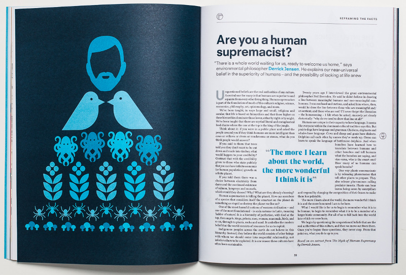
The magazine is beautifully designed, with appealing typography and layout, and large format photographs and illustrations
Background
Positive News has been around for a while. It was started as a quarterly newspaper in 1993 but was relaunched as a magazine by editor-in-chief Seán Dagan Wood in 2015. The crowdfunding campaign for the co-op raised £263K (about $340K). The co-ownership model is becoming increasingly popular in the UK — nonprofit magazine New Internationalist launched a similar campaign earlier this year and raised £704K.
As part of its crowdfunding campaign, Positive News published a business plan, which includes long-term revenue goals. I was not able to find public information about revenue and spending beyond the plan, and have not received a response to an email inquiry. That said, the numbers here are still too small to worry about excessive compensation or bloat.
With a small budget, the site has managed to build a sizable social media presence, especially on Facebook, where it has more than 250K followers. Several multi-million dollar nonprofit journalism organizations we’ve reviewed do not come close to those numbers.
Revenue Model
Positive News is largely funded by print subscriptions. Subscribers get access to a digital version, but it’s impossible to directly buy individual issues of the magazine in digital form. The “Own the Media” campaign website is still up, but no community shares are currently up for sale.
There are no ads on the site, but there is a page dedicated to “brands of inspiration” — essentially a selective approach to sponsorship. Occasionally, staff writers write longer articles about these brands (which disclose the sponsorship).
That approach isn’t without risks — would Positive News report fairly about a competitor that doesn’t want to be a sponsor? Would it include legitimate criticisms? Do readers fully understand the sponsorship relationship? While all the featured businesses tend to be in the green/organic/pro-social category, the criteria for becoming a partner are not public.
I don’t want to overstate the issue. Positive News is not in the business of writing exposés about corporate abuses, so it is unlikely the sponsorship will clash with investigative work. And in any case, only two such sponsored “advertorials” can be found on the website so far. Still, a more transparent process for selecting partner brands would be welcome.

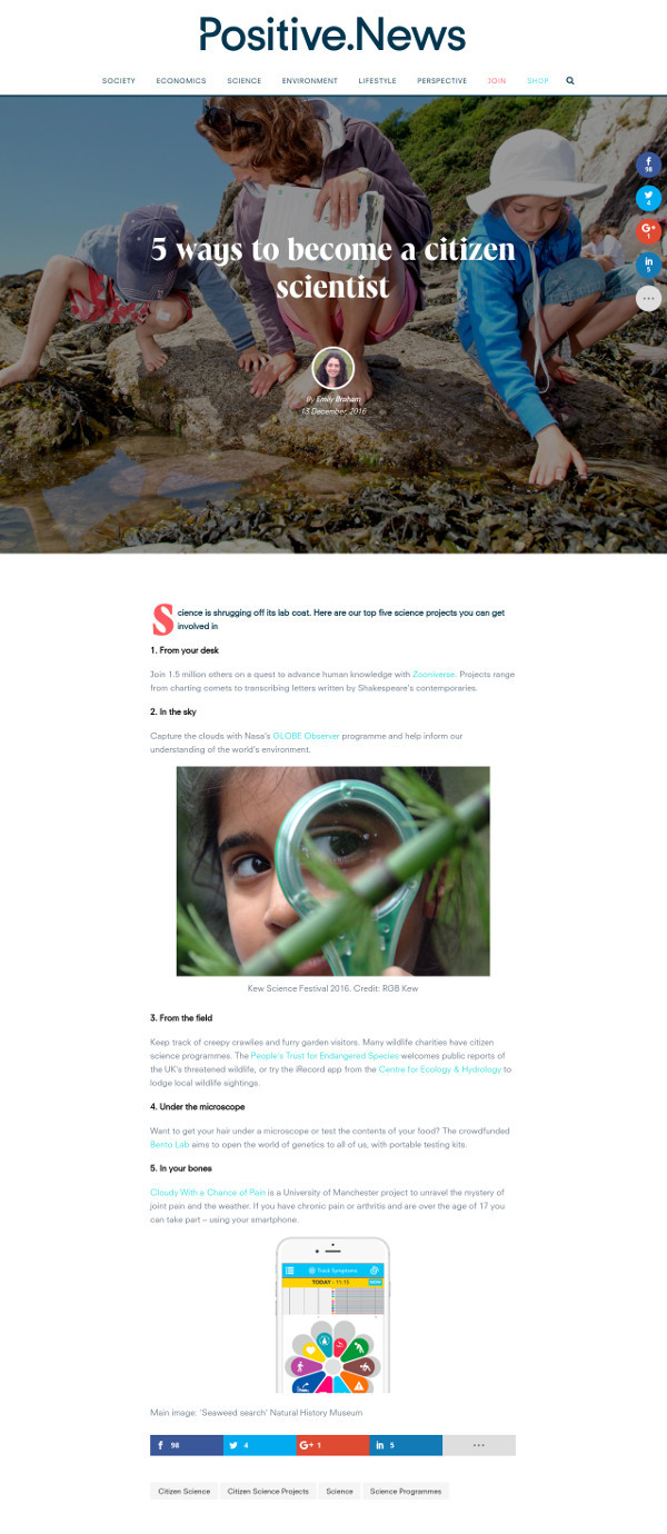
Like the magazine, the website design puts photographs and illustrations front and center — perhaps a bit at the detriment of readability for shorter articles
Design and Content
The website publishes feature-length articles and short newswire pieces, categorized into sections such as “lifestyle” or “economics”. Just like the printed magazine, the site is very visual, placing significant emphasis on design, typography and large lead images.
The site uses Disqus for comments. Activity is low (most conversations happen on the site’s Facebook feed) but there is little trolling or negativity in the comment section.
Although the organization is based in the UK, much of its reporting is international in nature (some is syndicated from other sources, including NGOs). The articles tackle tough subjects: climate change, terrorism, racism, and so on. But they focus on people working on solutions (“on patrol with an all-women anti-poaching unit”; “5 grassroots responses to terror attacks”) rather than on simply pointing out the gravity of problems.
For the most part, this isn’t about replacing bad news with good news — it’s about restoring a sense of agency. I found the reporting reasonably dispassionate, but it typically only scratches the surface and is not evaluative in nature (“does this work?”).
Site content is under conventional copyright.
The Verdict
I recommend adding Positive News to your media diet: 4 out of 5 stars. I am swayed by the argument that constructive journalism is psychologically valuable, and it undeniably brings attention to important causes. It also may inspire readers to replicate good ideas.
The organization behind the site would benefit from greater transparency about its revenue model and its plans for the future, especially if it intends to further pursue sponsorships and advertorials which may compromise real or perceived impartiality.
The site’s large social media reach demonstrates that there is a growing hunger for this type of journalism. Other media ventures would do well to consider how they can provide similar value to their audiences, e.g., by doing more feature reporting on solutions as opposed to problems.
